Prezi Zen for Open House Harmony

Some rights reserved by fiddle oak

The only thing I love more than Japanese food and standup comedy is a good presentation, so you can imagine my delight at Course 3’s videos on Presentation Zen and Death by Powerpoint. Actually, I may have just now overstated my preference for the aforementioned foods and performances. Nonetheless, I’ve always been a Harvard Outline Notes kind of guy. They’re neat, sequential, and got me through six years of undergrad and graduate school at Northwestern. As a teacher, I constructed my Powerpoints from Harvard Outline Notes, pasting a few bullets (only two or three, honest!) onto a slide. My only homage to design was a plain black background and single image per slide, both inspired by Steve Jobs’ product announcement Keynotes. Thanks to Matt Helmke and Garr Reynolds, though, I’m now a Powerpoint ex-con – someone no longer dealing death by Powerpoint.

I took several of Reynold’s Presentation Zen principles to make a Prezi for last week’s Open House, in an effort that has set the tone for all of my future lectures and workshops.

  1. Planning unplugged: I work out a lot – powerlifting, swimming, and rowing – and I used that time to organize my thoughts and come up with a layout.
  2. Focusing on relevance: I came up with topics that I felt were important to teachers, like the behaviors and skills that students need to succeed in my class and the specific, everyday indicators that would demonstrate that success.
  3. Sticky ideas: my ideas were very concrete, especially my examples of how we would know that students were being successful in history class.
  4. Noise reduction: I didn’t include number, figures, or specific evidence that parents could find in the syllabus. Instead, I expanded on those cold prescriptions and made a relatable document.
  5. Simplification: I’m a kludgy, inelegant writer, so it’s a minor miracle my ratio of images to text

Take a look at the Prezis – embedded after the break.
Continue reading Prezi Zen for Open House Harmony
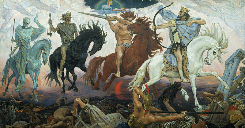
The Hook

The Воины Апокалипсиса (Four Horsemen of Apocalypse) by Viktor Vasnetsov (1887)
Here’s a delightful image I use to introduce my lesson on the Black Death and 100 Years’ War in my Ancient World History class. I display it, without explanatory text, at the beginning of the class as a bellwork activity. The students try to guess what the painting depicts and who the figures are. With my predominantly Arab student population, most of them aren’t familiar with the idea of the Four Horsemen of the Apocalypse, but the kids display insight and creativity in coming up with responses. Through class discussion, the students are eventually able to identify the spectres of war, death, famine, and plague as issues that medieval Europe faced.

This is just one example of how my bellwork activities hook kids and introduce my lessons. Using an image or video is oftentimes more useful than a text: reading a text takes longer and appeals to a narrower segment. The barriers to entry of visual analysis are much lower, so even lower-level students are engaged. Furthermore, the kids do a surprisingly thorough job of teasing out the details and making inferences, although I sometimes have to guide them.

Some other examples of visuals as a hook for a lesson:

Thich Quang Duc for a lesson on the French Revolution

North Korean army parade for a lesson on Spartan militarism

Be a Scythe

The Before
Week 1’s readings gave me ideas about how to organize and distill my writing and standardize my blog’s appearance to make it more reader-friendly. With recruiting season beginning along with swim tryouts beginning on Wednesday, I’ll work especially hard to apply those prinicples in this first COETAIL Course 3 response.


  1. Writing style: chop, bullet, chop
  2. Since readers need to be hooked immediately, I need to continue writing in the “inverted pyramid” (or inductive) style: a few lines of introduction followed by a succint conclusion. Evidence should comprise the remaining body of my posts, and I should use bullet points to highlight key ideas.

  3. Content: Just the facts, ma’am.
  4. Readers are looking for original thinking, devoid of “marketese,” that gives them useful and relevant information. The point of my blog is to showcase my teaching and share my experiences integrating technology in an international classroom, so I should use anecdotes and conclusions from my day-to-day life rather than make broad proclamations and philosophical observations. I also need to give background and context to reach readers with less technology experience than myself.

  5. Blog Appearance: Bigger, smaller, more vibrant.
  6. The After
    The reading on visual hierarchy discussed how size and color could be used to indicate a hierarchy of ideas: main ideas larger/in one color, subtopics smaller/in another. My blog has some size issues: the social media sharing buttons are large enough that they immediately draw the eye, whereas they should be something that readers reach after scanning the title and introductory text. I need to make these buttons smaller. I should also choose a color scheme to harmonize the Twitter feed and Disqus comment sidebar panes to indicate that these have like importance. Finally, for consistency, I should standardize the width of images on blog posts since my post content is all at the same level of importance.
    It would also be nice if the post background were offset in a different color from the page background. I’ll look into editing the page template (update: the issue was due to my omission of CSS code when modifying the theme; fixed it though), or I may look into a different theme. My rationale for choose the current one was that it didn’t have a huge header image that obstructed the main post content, but Week 2 and 3’s readings are making me rethink the purpose of my site images.


  7. Powerpoint Principles: Imagify
  8. I’ve realized that the Week 2 and 3 readings address Powerpoint principles further, but the visual hierarchy reading has given me a foundation of how to make my powerpoints more user friendly. Instead of my current style of Harvard outline notes accompanied by a relevant image, I can use a mind map/graphic organizer style Powerpoint or Starboard canvas, using size hierachy to indicate main ideas and replacing most of the text with images. I could assign a color to each RECIPES component and even use that color as frame for each image. More on this later.