Here’s my Course 3 video. I didn’t finish it in time for the Course 3 Reflection, but better later than never, right? It was a fairly straightforward process to create it, but for me it looked like:
Brainstorm in my head, come up with initial concept
Outline on notebook paper
Match images to outline
Match music to outline
Write script & record voiceover (2 hours to this point)
Find images and music (4 hours to this point)
Add voiceover to iMovie; then add images and music
Shoot footage; add to iMovie (another 2-3 hours)
Tweak, tweak, tweak (probably 7 hours total from inception to completion)
I didn’t use a storyboard template to sketch out my scenes because I shot little original footage and relied mostly on images from the web. For the footage I did shoot, the purpose was instructional so it wasn’t as important to have creative cinematography.
I made my video using iMovie, still images, and the original footage that I shot on a handheld Panasonic camcorder recording to an SD card. Of the hours and hours that I spent, some of it was in figuring out how to work with clips in iMovie, but more of it was in tweaking the pace of the audio and figuring out when to cue music, video, and images. In other words, my problem was creative and artistic, not technical.
Here’s the video:
And here’s everything that could have been done better:
Transmedia storytelling makes the audience piece together a narrative spread across many mediums. Image: some rights reserved by INTVGene.The first I heard of transmedia storytelling – using diverse media including TV, Web, games, and print – to tell a story was The Matrix. The creators started off with a movie, but also released animated short films, a comic, and video games. Each of these contained unique clues and backstory to the Matrix universe, so to get the whole story you needed to process several mediums and use several skills (for example, to read the comic or beat the video game).
The discipline of history and social studies emphasizes using a variety of sources to get students to understand a theme. Transmedia storytelling is a perfect match for this. From a teacher’s perspective, we might use the textbook as our text resources, add video interviews or newspapers as primary sources, and use photographs of artifacts or paintings as visual resources. For example, a unit on World War II examining the causes, processes and effects of war might include:
newspaper editorials from British newspapers (causes and processes)
Roosevelt’s Declaration of War speech (available on YouTube) (causes)
playing a level from a World War II video game, like Call of Duty (processes)
radio broadcasts from the end of the war (effects)
Or, you could have students organize a transmedia campaign about a specific event. For example, my students just studied the French Revolution. I could have had them tell the story of the French revolution by:
Finding paintings of pre-revolutionary life to illustrated the causes of the revolution
Mashing up documentaries from Youtube and popular movies to tell the story of one stage, such as the terror.
Finding primary sources to talk about the ideas of the revolution – the writing of Enligtenment philosophes, the Declaration of the Rights of Man and Citizen, etc.
Creating a comic book to tell the story of another stage
Telling the story of yet another stage from the perspective of the participants, but through a series of Twitter posts
Come to think of it, maybe this is something I should consider for History Circles 2.0!
It’s easy to speak of success in broad strokes: “America has a strong economy,” “America is powerful.” But how can we define success more clearly? This is an essential question of my World History courses, and to help students both define success and visualize what that looks like over time I use Gapminder.org at the beginning of the year to introduce the question to them. Gapminder takes statistical data from the past 200 years and charts it two-dimensionally. It follows visual hierarchy rules by distinguishing countries by size and color, and can animate its charts to show how statistics change over time. Here’s a great demo:
In this exercise, students analyze visual sources and construct their own definitions about success. First, I demonstrate how to use the Gapminder website, then give students a worksheet so they can engage in independent but guided investigation. Once students have had a chance to look at various indicators, I ask them to define success – do we want a country with high literacy rates? Long life expectancy? A high GDP per capita, or a high overall GDP? A low corruption index? This is where having an IWB works well – students can pull up Gapminder at the front of the room and single out countries for the class to illustrate their point.
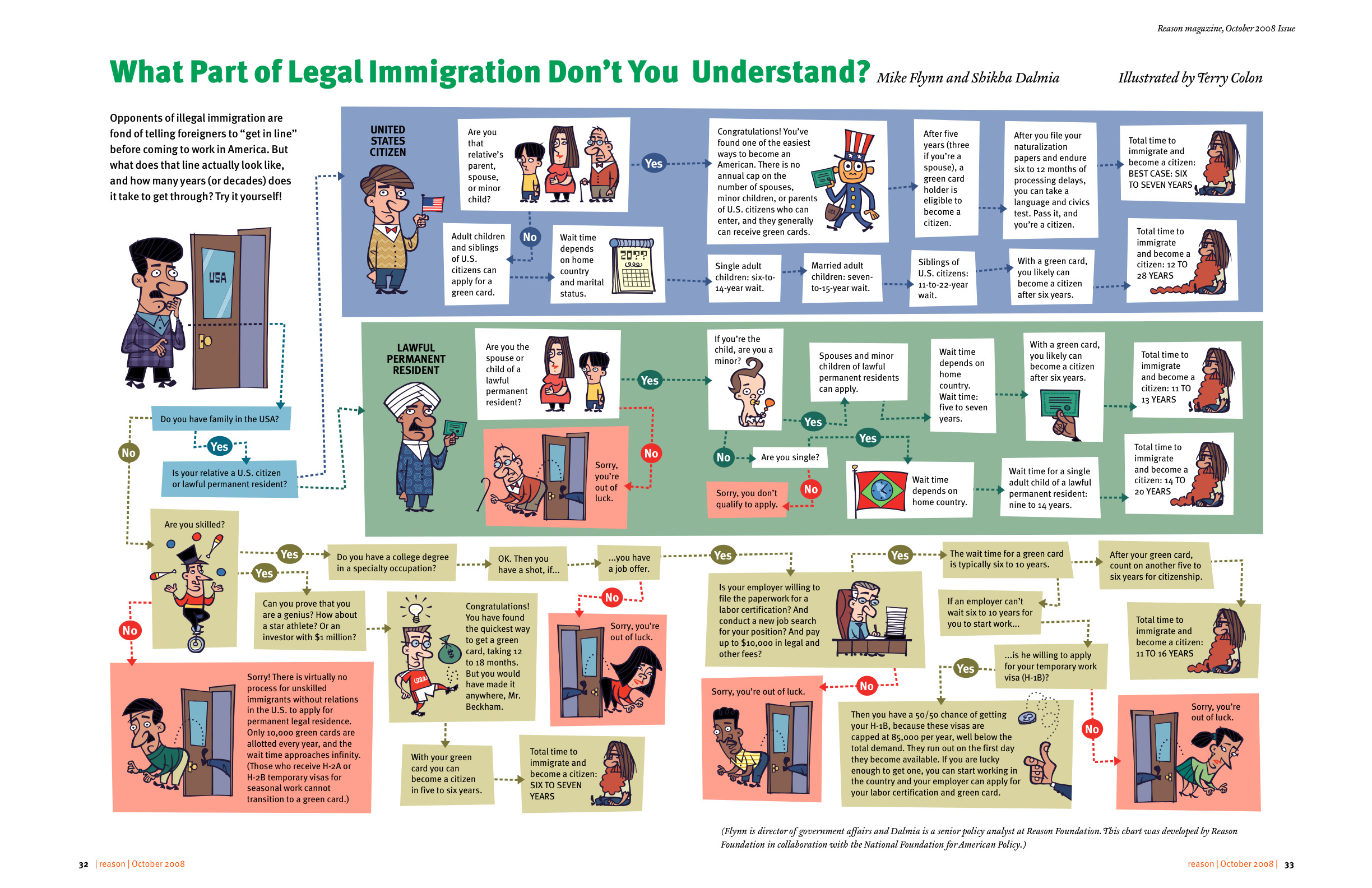
Here’s another example of an infographic useful in studies of modern American immigration:
I’d give students the profiles of four or five people, and ask them to calculate based on the infographic how long it would take them to become American citizens. Then, I’d ask them to reflect on whether they think American immigration policy is effective, and what they would change, if anything.
History is, of course, the story of human civilization. The core skill of explaining change over time – which brings in elements of context, causality, and chronology, whether you’re in AP World, DP History, or regular ole history – requires that you paint a story in broad strokes. The problem that I run into is that we cover so much history in a short time that we can rarely stop and smell the flowers. There are so many powerful stories in history that we don’t need to learn in order to understand the big picture. Digital storytelling could bring these to students’ attention, increase their engagement while harnessing their creative talent, appealing to their individual learning styles, and developing valuable technology and communication skills (The Educational Uses of Digital Storytelling).
Topic Selection
How would this work? First would be the selection of compelling stories that fit with the content. I’d leave it to the teacher to provide a short menu to the students, with a short (140 character?) teaser for each. For example:
Emperor Romanos IV’s crushing defeat at Manzikert
Genghis Khan’s terrifying response to the insults of the Khwarizmid empire
Emperor Constantine’s stunning revelation at the Battle of the Milvian Bridge
The Fall of Constantinople
The Storming of the Bastille
Collaboration and Sharing
Students could work alone or in pairs (our readings emphasize how digital storytelling can be a very personal affair) to create a digital story about their chosen event, and then present it to the class. We could take this a step further and have students post their projects online, then have other students give feedback and reactions. At my school we use Moodle for our courseware, so I would have students upload their videos to Youtube, embed them in a Moodle forum thread, and have the feedback be given in replies inside that thread. The advantage over using Youtube’s comments is that only registered students in the course would be able to give feedback, and students wouldn’t have to sign up for a Gmail/Youtube account to give feedback.
Assessment
One approach to assessing this would be to use a rubric based on the Seven Elements of Storytelling. UH gives an even more complex rubric. Seven dimensions seems unnecessarily complex: good for planning, but poor for assessment purposes. I’d assess on fewer components:
Content: the relevance, significance, and accuracy of the information
Professionalism: the quality of the editing and presentation
Creativity: the appropriateness of the music and visuals
This would be more appropriate for my 9th and 10th grade students, who need instructions and expectations broken down into smaller steps when tackling big projects.
The only thing I love more than Japanese food and standup comedy is a good presentation, so you can imagine my delight at Course 3’s videos on Presentation Zen and Death by Powerpoint. Actually, I may have just now overstated my preference for the aforementioned foods and performances. Nonetheless, I’ve always been a Harvard Outline Notes kind of guy. They’re neat, sequential, and got me through six years of undergrad and graduate school at Northwestern. As a teacher, I constructed my Powerpoints from Harvard Outline Notes, pasting a few bullets (only two or three, honest!) onto a slide. My only homage to design was a plain black background and single image per slide, both inspired by Steve Jobs’ product announcement Keynotes. Thanks to Matt Helmke and Garr Reynolds, though, I’m now a Powerpoint ex-con – someone no longer dealing death by Powerpoint.
I took several of Reynold’s Presentation Zen principles to make a Prezi for last week’s Open House, in an effort that has set the tone for all of my future lectures and workshops.
Planning unplugged: I work out a lot – powerlifting, swimming, and rowing – and I used that time to organize my thoughts and come up with a layout.
Focusing on relevance: I came up with topics that I felt were important to teachers, like the behaviors and skills that students need to succeed in my class and the specific, everyday indicators that would demonstrate that success.
Sticky ideas: my ideas were very concrete, especially my examples of how we would know that students were being successful in history class.
Noise reduction: I didn’t include number, figures, or specific evidence that parents could find in the syllabus. Instead, I expanded on those cold prescriptions and made a relatable document.
Simplification: I’m a kludgy, inelegant writer, so it’s a minor miracle my ratio of images to text
The Воины Апокалипсиса (Four Horsemen of Apocalypse) by Viktor Vasnetsov (1887)Here’s a delightful image I use to introduce my lesson on the Black Death and 100 Years’ War in my Ancient World History class. I display it, without explanatory text, at the beginning of the class as a bellwork activity. The students try to guess what the painting depicts and who the figures are. With my predominantly Arab student population, most of them aren’t familiar with the idea of the Four Horsemen of the Apocalypse, but the kids display insight and creativity in coming up with responses. Through class discussion, the students are eventually able to identify the spectres of war, death, famine, and plague as issues that medieval Europe faced.
This is just one example of how my bellwork activities hook kids and introduce my lessons. Using an image or video is oftentimes more useful than a text: reading a text takes longer and appeals to a narrower segment. The barriers to entry of visual analysis are much lower, so even lower-level students are engaged. Furthermore, the kids do a surprisingly thorough job of teasing out the details and making inferences, although I sometimes have to guide them.
Some other examples of visuals as a hook for a lesson:
Thich Quang Duc for a lesson on the French Revolution
North Korean army parade for a lesson on Spartan militarism
The BeforeWeek 1’s readings gave me ideas about how to organize and distill my writing and standardize my blog’s appearance to make it more reader-friendly. With recruiting season beginning along with swim tryouts beginning on Wednesday, I’ll work especially hard to apply those prinicples in this first COETAIL Course 3 response.
Writing style: chop, bullet, chop
Since readers need to be hooked immediately, I need to continue writing in the “inverted pyramid” (or inductive) style: a few lines of introduction followed by a succint conclusion. Evidence should comprise the remaining body of my posts, and I should use bullet points to highlight key ideas.
Content: Just the facts, ma’am.
Readers are looking for original thinking, devoid of “marketese,” that gives them useful and relevant information. The point of my blog is to showcase my teaching and share my experiences integrating technology in an international classroom, so I should use anecdotes and conclusions from my day-to-day life rather than make broad proclamations and philosophical observations. I also need to give background and context to reach readers with less technology experience than myself.
Blog Appearance: Bigger, smaller, more vibrant.
The AfterThe reading on visual hierarchy discussed how size and color could be used to indicate a hierarchy of ideas: main ideas larger/in one color, subtopics smaller/in another. My blog has some size issues: the social media sharing buttons are large enough that they immediately draw the eye, whereas they should be something that readers reach after scanning the title and introductory text. I need to make these buttons smaller. I should also choose a color scheme to harmonize the Twitter feed and Disqus comment sidebar panes to indicate that these have like importance. Finally, for consistency, I should standardize the width of images on blog posts since my post content is all at the same level of importance.
It would also be nice if the post background were offset in a different color from the page background. I’ll look into editing the page template (update: the issue was due to my omission of CSS code when modifying the theme; fixed it though), or I may look into a different theme. My rationale for choose the current one was that it didn’t have a huge header image that obstructed the main post content, but Week 2 and 3’s readings are making me rethink the purpose of my site images.
Powerpoint Principles: Imagify
I’ve realized that the Week 2 and 3 readings address Powerpoint principles further, but the visual hierarchy reading has given me a foundation of how to make my powerpoints more user friendly. Instead of my current style of Harvard outline notes accompanied by a relevant image, I can use a mind map/graphic organizer style Powerpoint or Starboard canvas, using size hierachy to indicate main ideas and replacing most of the text with images. I could assign a color to each RECIPES component and even use that color as frame for each image. More on this later.